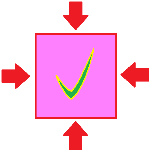
Easy Article Margins with CSS

So, if you've been a web developer before, you have surely ran into the problem of how tacky it looks for the text to go the total way across the screen. It is also not visually pleasing for text to head butt the top of the window, or for the text to run all the way to the bottom of the viewport.
One way to solve this would be to put in constants to measure out how wide you want your paragraphs to be. The problem with this approach is that it will only work on the device you are developing on. So if you are developing on a laptop, then when you load your page on a phone or tablet things may be off.
What We Need is a Way to Employ Margins That Works Across Devices
We can do this with a combination of two HTML divs, and some CSS. First, wee will need some HTML:
An Explanation of the HTML
There are only two divs here. The div with the id "mainScroller" is representative of your main scrolling container. In some cased this may be the body element, and in other cases this may be a div. The inner div with the id "mainMargin" is the div doing the heavy lifting for our margins. We will achieve our margins with the following CSS.
An Explanation of the CSS
The CSS for #mainMargin is very strait forward. It is just to frame our margin element. The CSS for the #mainMargin element goes as follows:
- width:96%; This line ensures that on small screens, the width can't become the total width of the screen.
- max-width:700px; This will keep the article narrow on larger screens. It is hard to read paragraphs that are spread out extremely wide.
- display:inline-block; This will keep the margin container horizontally centered if the max-width is encountered.
- padding-top:5vh; This is to keep the top of your article from head butting the top of your scroll container
- padding-bottom:5vh; This is to keep a pleasant space at the bottom of your article.
I hope this helps!
Next time you need to make some article margins, don't be scared! Say, "I've got this: I've learned that already. However, you could save yourself a lot of personal time, and just call Web Apps Actualized
Get Coding Lessons
This blog application was produced and is managed by Web Apps Actualized
Need a website? Or how about a web system for your business? Contact us and tell us about your idea, so we can start making your dream a reality.
Here is our main site.
Programs and Resources Used
WebDev Suite (in house) - Microsoft Paint - Microsoft Paint 3d - Apache Open Office Draw - Microsoft Windows - Guitar Pro 6 - Stack Overflow - W3Schools - PHP.net - Web Browsers (Mostly Chrome) - Apache XAMPP - Git - Cmake - Brotli Compression - JShrink Minifier Combined with Rodrigo54 Minifier - cwebp
